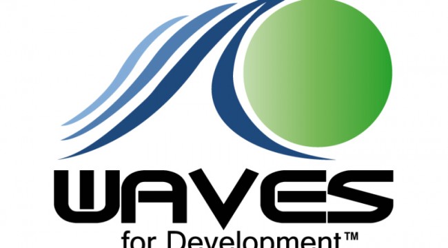
WAVES logo evolves
24 Oct 2011by Dave Aabo
We are proud to announce the evolution of the WAVES logo. We look to this as one of the first steps in re-defining our visual identity. Thanks to Nick Lynn, for building on the original logo developed by Emilio Amico, brother of WAVES Peru founder, Daniela.
Mr. Lynn has this to share about the evolution:
“The logo was evolved for many reasons. Most important to note, however, is that all the elements of the logo are in tact, and the spirit of the logo has been preserved. The new incarnation allows the logo to be (most importantly) VISUALLY LEGIBLE — this means that from a distance or in small sizes it always works. This translates into clearer perception, and less visual noise, all good connotations for any organization.
Subtly, the now separate lines convey a sense of rhythm and pattern; these are positive characteristics, and easily sync with thoughts of waves or the ocean. When the waves were on top of one another, not only was the logo busier, visually, but it also contained overlapping, competing shapes, vying for your visual attention. Neither of those are desirable traits for a company. Another perk of this new treatment is that since all the shapes are distinct, it easily translates into one color; that’s always the most cost-effective way to print.
Largely, though, the best benefit I can point to is the renewed visual clarity, along with the more friendly personality conveyed by the new approach. I think with a more appropriately tuned treatment for the typography we’d really be in the right spirit.”
More of Nick’s creations can be found here: http://www.boxkiteproject.com/
Posted in: News
Tags: Boxkite Project, Daniela Amico, Element28, Emilio Amico, Logo, Nick Lynn, WAVES Peru


